Building My Own Blog Editor with Tauri
A Windows and Android app for writing this blog: three editor views, R2 image uploads and one-tap publishing to GitHub.
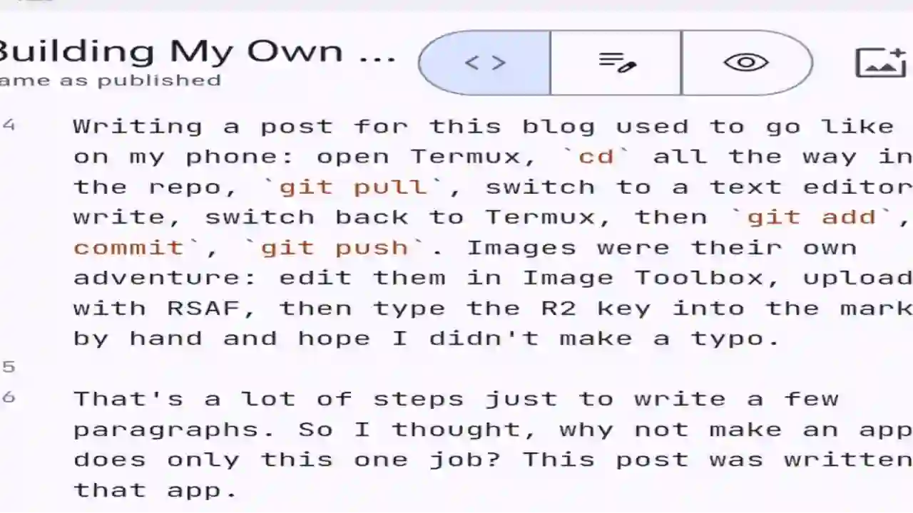
Writing a post for this blog used to go like this on my phone: open Termux, cd all the way into the repo, git pull, switch to a text editor, write, switch back to Termux, then git add, git commit, git push. Images were their own adventure: edit them in Image Toolbox, upload them with RSAF, then type the R2 key into the markdown by hand and hope I didn’t make a typo.
That’s a lot of steps just to write a few paragraphs. So I thought, why not make an app that does only this one job? This post was written in that app.
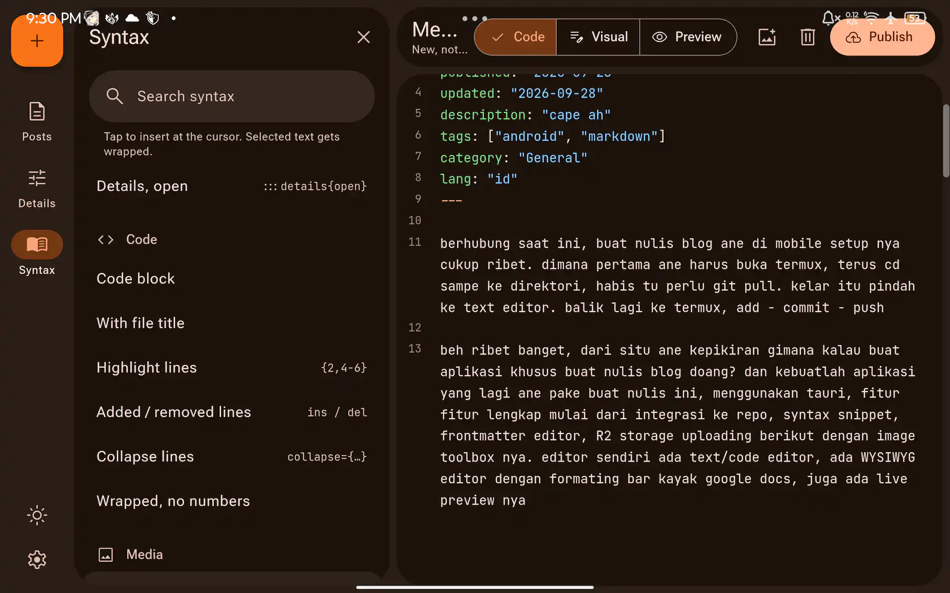
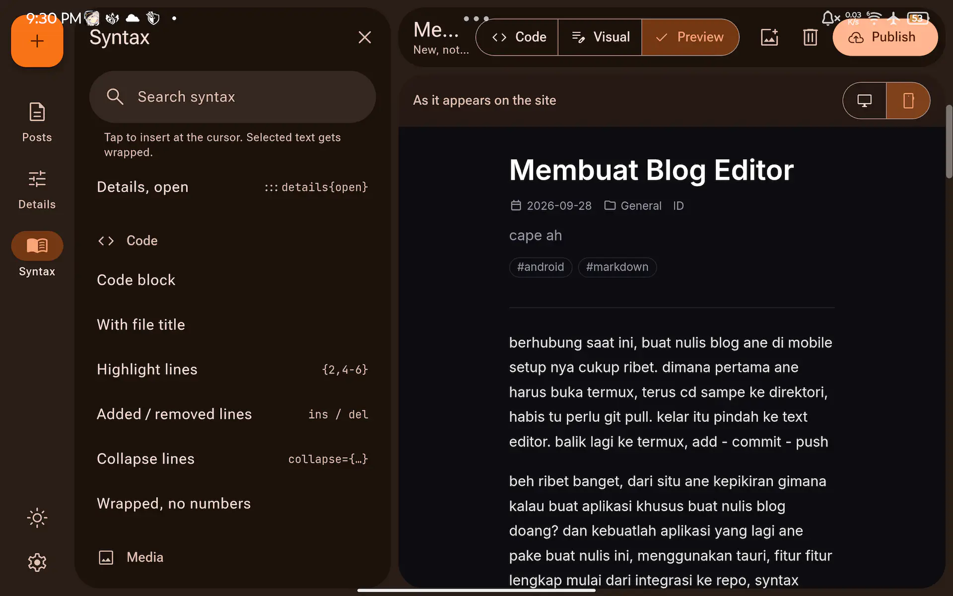
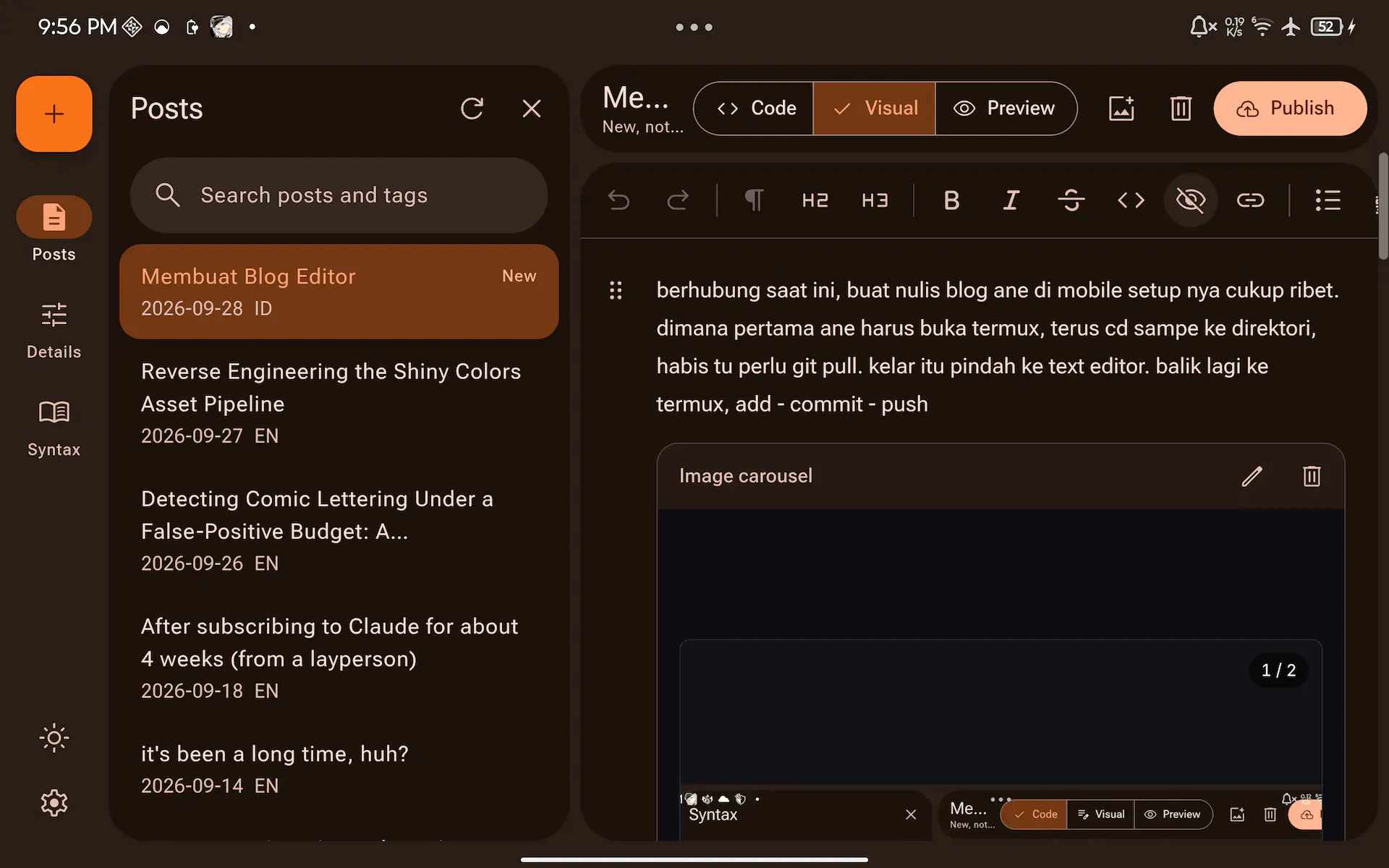
What it does#
- Three views: a markdown code editor, a visual (WYSIWYG) editor with a formatting bar, and a live preview that looks exactly like the real site.
- Straight to the repo: it lists the posts from GitHub, keeps drafts on the device, and publishing is one commit through the GitHub API. No git and no terminal.
- Frontmatter form: title, dates, tags (with suggestions from other posts), language and password protection, so I don’t have to hand-edit YAML.
- Syntax cheat sheet in a sidebar. Tap an item to insert it at the cursor.
- Image uploads to R2 with conversion settings in the style of Image Toolbox: format, lossy or lossless, quality, or a target file size.
- A change gutter like VS Code’s, marking the lines I’ve added or changed since the last publish.
- Runs on Windows and Android, with a phone layout (bottom navigation bar) and a tablet layout (rail plus side pane).
The stack#
| Part | Choice |
|---|---|
| App shell | Tauri 2 (Rust, with WebView2 on Windows and the system WebView on Android) |
| UI | Vue 3, Vite, Tailwind 4, Material Design 3 |
| Code editor | CodeMirror 6 |
| Visual editor | ProseMirror with prosemirror-markdown |
| Preview | the blog’s own markdown-it renderer (Shiki, Mermaid, KaTeX) |
| Image encoding | jSquash (WebP, AVIF, JPEG, PNG, OxiPNG) in a Web Worker |
| Storage | Cloudflare R2, signed on the Rust side with rusty-s3 |
| Secrets | Windows Credential Manager, Android Keystore |
I picked Tauri over Electron mostly for size. The Windows installer is about 10 MB and the Android release APK is 23 MB. The same Vue frontend runs on both, and the Rust side handles whatever the web view shouldn’t: secrets, signing requests, and a few Android-only things.
flowchart LR
    UI["Vue frontend<br/>(CodeMirror, ProseMirror, preview)"] -->|posts, commits| GH[GitHub API]
    UI -->|invoke| RS[Rust core]
    RS -->|presigned requests| R2[Cloudflare R2]
    RS --> KS["Credential Manager /<br/>Android Keystore"]
    UI -->|encode| W[Image worker]
The preview is the real renderer#
A preview that’s only close to the site is useless, because the thing I want to catch is exactly where they differ. So the app doesn’t have its own renderer. A small script copies the blog’s MarkdownRenderer.vue into the app before every dev run and build, so the preview runs the same markdown-it pipeline, with the same plugins and the same CSS, as the live site.
There’s a catch: the blog repo is private, and the editor repo is public. So the copied renderer is git-ignored and never lands in the editor repo; it’s pulled from my local checkout at build time.
The hard part: a visual editor that doesn’t wreck my markdown#
This was the part that took the longest. The usual way a WYSIWYG markdown editor works is: parse the markdown into a document, let you edit it, then serialize the whole thing back to markdown. The problem is that the serializer writes markdown its way. *italic* becomes _italic_, list markers change, blank lines move, and my custom ::: blocks come back mangled. Open a post, fix one typo, and the commit diff touches every line.
The fix was to remember where every block came from. When a post is loaded, each top-level block in the ProseMirror document is mapped back to the exact slice of the source it was parsed from. When saving, a block that hasn’t been touched is written back byte for byte from the original. Only the blocks I actually edited go through the serializer.
To make sure it holds, I ran all my existing posts through an open-and-save round trip with no edits. All 13 came back byte-identical, across 1147 blocks.
The blog’s custom blocks (Mermaid diagrams, GitHub cards, carousels, embeds) show up in the visual editor as cards that render the real thing, with an edit button that opens the raw source.
Making the diagrams fast#
The first version froze. Opening the visual view on the Mermaid examples post blocked the UI for about 15 seconds, because every diagram was rendered up front, and the preview re-rendered every diagram on every keystroke. Two changes fixed it:
- a Mermaid cache keyed by the diagram source, so a diagram that didn’t change is never rendered again, and
- lazy cards that render only when they scroll into view, with a skeleton in their place until then.
Opening the visual view went from 15.6 s blocked to 0.6 s, and a preview re-render from 4.9 s to 0.14 s.
Images: R2 without the storage manager#
Uploading is drag and drop (or a file picker on Android). The image dialog lets me pick the format, lossy or lossless, quality, max width, or a target size. The encoding runs in a Web Worker with jSquash, so the UI doesn’t stall. For a target size it does a binary search over the quality: encode, check the size, go up or down. When I set 100 KB, the file in the bucket came out at 97 KB.
The R2 secret never touches the web view. The frontend only asks the Rust side to “put these bytes at this key”, and Rust signs the request with rusty-s3 and sends it with reqwest. The key follows the same layout my old posts already use, posts/<year>/<slug>/, and uploads never overwrite. If cover.webp already exists, the new one becomes cover.v2.webp.
Note
On Android, Tauri can’t hand raw bytes from the web view to Rust, so there the image goes over as base64 inside JSON. Desktop keeps the raw path. I only found this when the first upload on the tablet failed with “expected file as raw body”.
The change gutter#
I wanted the little colored bars you get in VS Code: green for added lines, blue for changed, a red marker where lines were deleted. CodeMirror has a merge extension, but its chunks are character-based and too coarse, so one small edit could paint half a paragraph. I replaced it with a plain line-level Myers diff against the published version, and fuzz-tested it with 3000 random edits.
Keeping the token safe#
Signing in takes a fine-grained GitHub token limited to the blog repo with Contents set to read and write. Nothing more.
- On Windows the token and the R2 keys go into the Windows Credential Manager through the
keyringcrate. - On Android there’s a small Kotlin plugin that encrypts each value with AES-256-GCM, under a key that lives in the Android Keystore. Only the ciphertext is stored in the app’s private storage.
The R2 secret is also marked Rust-only: the frontend can save it, but can never read it back.
Android was its own adventure#
The desktop app worked early. Android took a few more rounds:
- Edge to edge. The first build drew under the status bar and the gesture bar. The WebView does report their size as safe-area insets, so every screen now pads itself with
env(safe-area-inset-*), and the status bar icons switch between light and dark with the theme. - The keyboard. Newer Android no longer resizes edge-to-edge apps when the keyboard opens, so it covered the editor. The app now sizes itself to
visualViewport, hides the bottom bar while typing, and scrolls the cursor back into view. - The back gesture closes the open dialog first, then goes back to the post list, and only then leaves the app.
- A red herring. At one point R2 and even GitHub looked unreachable. It was Android’s background network restriction, which kicked in because the app wasn’t in the foreground while I was testing it over USB.
The UI#
The UI follows Material Design 3. The whole palette is generated from one seed color with material-color-utilities: orange by default, changeable in the settings, or taken from the wallpaper on Android 12 and up. It’s dark by default with a light theme toggle. The layout changes with the width: bottom navigation on phones, a rail with a single pane on small tablets, and a rail plus a side pane (posts, details or cheat sheet) next to the editor on big screens like the Legion Y700.
Where it’s at#
It works, I’m using it, and this post went through it from the first line to the publish button. There are ideas left, like slash commands in the visual editor and scroll sync for the split view, but for now I’m parking it here.
The code is on GitHub (the editor only; the blog itself stays private):
vermilion10/vermilion10-blog-editor Loading repository info…